用 Kandy 实现 Kotlin Notebook 中数据可视化
Kotlin offers an all-in-one-place solution for powerful and flexible data visualization, providing an intuitive way to present and explore data before diving into complex models.
This tutorial demonstrates how to create different chart types in IntelliJ IDEA using Kotlin Notebook with the Kandy and Kotlin DataFrame libraries.
Before you start
Kotlin Notebook relies on the Kotlin Notebook plugin, which is bundled and enabled in IntelliJ IDEA by default.
If the Kotlin Notebook features are not available, ensure the plugin is enabled. For more information, see Set up an environment.
Create a new Kotlin Notebook:
- Select File | New | Kotlin Notebook.
In your notebook, import the Kandy and Kotlin DataFrame libraries by running the following command:
 %use kandy
 %use dataframe
Create the DataFrame
Start by creating the DataFrame containing the records to visualize. This DataFrame stores simulated numbers of the monthly average temperature in three cities: Berlin, Madrid, and Caracas.
Use the dataFrameOf() function from the Kotlin DataFrame library
to generate the DataFrame. Run the following code snippet in Kotlin Notebook:
// The months variable stores a list with the 12 months of the year
val months = listOf(
    "January", "February",
    "March", "April", "May",
    "June", "July", "August",
    "September", "October", "November",
    "December"
)
// The tempBerlin, tempMadrid, and tempCaracas variables store a list with temperature values for each month
val tempBerlin =
    listOf(-0.5, 0.0, 4.8, 9.0, 14.3, 17.5, 19.2, 18.9, 14.5, 9.7, 4.7, 1.0)
val tempMadrid =
    listOf(6.3, 7.9, 11.2, 12.9, 16.7, 21.1, 24.7, 24.2, 20.3, 15.4, 9.9, 6.6)
val tempCaracas =
    listOf(27.5, 28.9, 29.6, 30.9, 31.7, 35.1, 33.8, 32.2, 31.3, 29.4, 28.9, 27.6)

// The df variable stores a DataFrame of three columns, including records of months, temperature, and cities
val df = dataFrameOf(
    "Month" to months + months + months,
    "Temperature" to tempBerlin + tempMadrid + tempCaracas,
    "City" to List(12) { "Berlin" } + List(12) { "Madrid" } + List(12) { "Caracas" }
)
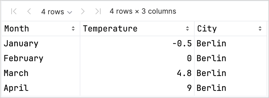
Explore the structure of the new DataFrame by looking into the first four rows:
df.head(4)
You can see that the DataFrame has three columns: Month, Temperature, and City. The first four rows of the DataFrame contain records of the temperature in Berlin from January to April:
There are different options to access a column's records that can help you increase type safety when working with the Kandy and Kotlin DataFrame libraries together. For more information, see Access APIs.
Create a line chart
Let's create a line chart in Kotlin Notebook using the df DataFrame from the previous section.
Use the plot() function from the Kandy library. Within the plot() function, specify the type of chart (in this case, it's line)
and the values for the X and Y axes. You can customize colors and sizes:
df.plot {
    line {
        // Accesses the DataFrame's columns used for the X and Y axes
        x(Month)
        y(Temperature)
        // Accesses the DataFrame's column used for categories and sets colors for these categories
        color(City) {
            scale = categorical("Berlin" to Color.PURPLE, "Madrid" to Color.ORANGE, "Caracas" to Color.GREEN)
        }
        // Customizes the line's size
        width = 1.5
    }
    // Customizes the chart's layout size
    layout.size = 1000 to 450
}
Here's the result:

Create a points chart
Now, let's visualize the df DataFrame in a points (scatter) chart.
Within the plot() function, specify the points chart type. Add the X and Y axes' values and the categorical values from the df columns.
You can also include a heading to your chart:
df.plot {
    points {
        // Accesses the DataFrame's columns used for the X and Y axes
        x(Month) { axis.name = "Month" }
        y(Temperature) { axis.name = "Temperature" }
        // Customizes the point's size
        size = 5.5
        // Accesses the DataFrame's column used for categories and sets colors for these categories
        color(City) {
            scale = categorical("Berlin" to Color.LIGHT_GREEN, "Madrid" to Color.BLACK, "Caracas" to Color.YELLOW)
        }
    }
    // Adds a chart heading
    layout.title = "Temperature per month"
}
Here's the result:

Create a bar chart
Finally, let's create a bar chart grouped by city using the same data as in the previous charts. For colors, you can also use hexadecimal codes:
// Groups by cities
df.groupBy { City }.plot {
    // Adds a chart heading
    layout.title = "Temperature per month"
    bars {
        // Accesses the DataFrame's columns used for the X and Y axes
        x(Month)
        y(Temperature)
        // Accesses the DataFrame's column used for categories and sets colors for these categories
        fillColor(City) {
            scale = categorical(
                "Berlin" to Color.hex("#6F4E37"),
                "Madrid" to Color.hex("#C2D4AB"),
                "Caracas" to Color.hex("#B5651D")
            )
        }
    }
}
Here's the result:

下一步做什么
- Explore more chart examples in the Kandy library documentation
- Explore more advanced plotting options in the Lets-Plot library documentation
- Find additional information about creating, exploring, and managing data frames in the Kotlin DataFrame library documentation
- Learn more about data visualization in Kotlin Notebook in this YouTube video